- OECD Study - Computers do not improve pupil results
- The Impact of Education Technology on Student Impact
- Wall Street Journal - Reporting on OECD
- Oversold and Underused
The last one is my personal favorite.
Google drive added something called My Maps. When I was a kid, I liked maps. I would spin a globe and find out where I would live when I grew up, though the middle of the pacific ocean was not very appealing to me, I liked that I could see where things were. I never did learn where the east coast states were though, they were so tiny on the map that I couldn't figure them out. I went to the University of Delaware and quickly learned where they all were. By the way, for those of you who do not know, Delaware is not the smallest state in the USA, that is Rhode Island. Delaware has the smallest population.
What the heck does that have to do with Technology? Well, maps are way better now.
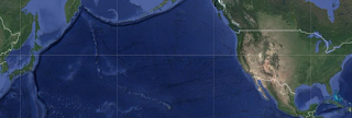
Check out the map that I posted below. While on that map, complete the following:
- Find Japan and trace the tectonic plate that goes from Japan to the USA.
- Find 3 pieces of evidence that shows the pacific plate is moving. Explain how this evidence supports the movement of the plate (direction, straight, spin, etc.). Find the direction that it is moving and compare that with evidence from a reputable scientific source.
If you had to give your students one of the 2 options above, one would suck and one would be kind of cool. The trick is that, in reality, the thing is just a map. Yes you can do cool things with it like add videos, images, customization, zoom in and out, change the base map, etc., but it is just a map.
How often have you spent examining maps to learn something new? Put it on a computer and POOF, its a learning tool. No, its a FRICKIN map. They kind of suck. What makes it cool is using it as a tool to get students to see something that they are learning, explore more deeply and find evidence of something that was discovered around 100 years ago by really smart people. Alfred Wegener, 1912, thought plate tectonics happened because he looked at a map and thought the continents fit together. Later the things was confirmed by Harry Hess in 1960.
It is kind of cool when you can take a process that happens at the same rate as fingernail growth (roughly 1 in per year) and show students that it is really happening and that it affects them.
- Follow the ticker tape leading northwest of Hawaii and see that there is a weak spot in the plate and Hawaii almost has a lot more islands.
- See the nexus of 3 plate boundaries and find out where there are so many earthquakes in Japan.
- See how close Bermuda is to the mid-ocean ridge and ask students to defend a thesis of why they think there are navigational issues we know as the Bermuda triangle.
Maps don't have to suck, technology doesn't have to suck. So don't make them.


